Thursday, 1 October 2020

HTML and CSS   UI design Product Layout 2020


PUMA FOOTBALL PRODUCT UI DESIGN

Hey friends, today we will make a product UI design with pure Html5 and Css3.

Here is the sample video of the design.


DOWNLOAD IMAGES FROM HERE:

HERE IS THE HTML CODE:

<!DOCTYPE html>
<html lang="en">
  <head>
    <meta charset="UTF-8" />
    <meta name="viewport" content="width=device-width, initial-scale=1.0" />
    <meta http-equiv="X-UA-Compatible" content="IE=edge">
    <link rel="stylesheet" href="style.css" />
    <title>PUMA</title>
  </head>
  <body>
    <div class="container">
      <div class="hero">
        <div class="logo">
          <img src="./logo.png" alt="" />
        </div>
        <div class="content">
          <div class="model">
            <h2>Puma 083285-02 TPU</h2>
            <ul>
              <li><strong>Brand</strong> Puma</li>
              <li><strong>Size</strong> 5</li>
              <li><strong>Material Type</strong> TPU</li>
              <li><strong>Manufacturer</strong> PUMA</li>
              <li><strong>Color</strong> ULTRA YELLOW-Black-Orange</li>
              <li><strong>Sport</strong> Soccer Ball, Football</li>
            </ul>
          </div>
          <div class="football">
              <img src="./fb.png" alt="">
          </div>
        </div>
        <div class="buy">
            <p>$22</p>
            <button>BUY NOW</button>
        </div>
        <div class="slogan">
            <div class="line"></div>
            <p>
                <strong>UNLEASH</strong>
                YOUR
                <strong>WILD</strong>
                SIDE
            </p>
        </div>
      </div>
    </div>
  </body>
</html>


HERE IS THE CSS CODE:

@import url('https://fonts.googleapis.com/css2?family=Carter+One&family=Julius+Sans+One&display=swap');
:root{
    --font1:'Carter One', cursive;
    --font2:'Julius Sans One', sans-serif;
}
*{
    margin0%;
    padding0%;
    box-sizing: border-box;
    overflow: hidden;
}
.container{
    height100vh;
    width: auto;
    max-width100%;
    max-height100%;
}
.hero{
    background-image: url(./bg.jpg);
    background-position: center;
    background-repeat: no-repeat;
    background-size: cover;
    height100vh;
    width: auto;
}
.hero .logo{
    position: absolute;
    left20px;
    top10px;  
}
.hero .logo img{
    height70px;
    width: auto; 
}
.content{
    display: flex;
    position: absolute;
    top180px;
    left50px;
    justify-content: center;
    align-items: center;
}
.content .model h2{
    font-size4rem;
    background: -webkit-linear-gradient(#db9621, #000000e1);
   -webkit-background-clip: text;
   -webkit-text-fill-color: transparent;
   letter-spacing.2rem;
   font-family: var(--font1);
}
.content ul{
    margin-top30px;
    margin-left20px;
}
.content ul li{
    font-size1.5rem;
    font-family: var(--font2);
    color: black;
    line-height3.5rem;
}
.content ul li strong{
    margin-right20px;
}
.football{
    position: relative;
    left60px;
    width500px;
}
.football img{
    height400px;
    transition: all ease 2s;

}
.football img:hover{
    transform: scale(1.05) rotate(360deg);
}
.buy{
    position: relative;
    top650px;
    right250px;
    float: right;
}
.buy p{
    font-size3.6rem;
    font-family: var(--font2);
    color: black;
    text-align: center;
}
.buy button{
    background: linear-gradient(#e9ad0a, #585213e1);
    padding15px 30px;
    margin-top30px;
    color: black;
    font-size1.6rem;
    cursor: pointer;
    outline: none;
    border: none;
    border-radius30px;
}
.buy button:hover{
    background: linear-gradient(#e9ad0a, #000000be);
}
.slogan{
    position: absolute;
    top680px;
    width300px;
    left40px;
    opacity.3;
    display: flex;
}
.slogan p{
    color: white;
    font-size2rem;
    font-family: var(--font2);
}
.slogan strong{
    color: #db9621;
    font-size3rem;
    font-family: var(--font1);
}
.slogan .line{
    background-color: #db9621;
    width5px;
    height110px;
    margin10px 10px;
}

Monday, 28 September 2020

How to get source code of any website

HOW TO GET SOURCE CODE OF ANY WEBSITE 


Hello friends, how are  you all. If you are learning web development or you are not understand the layouts of other website.

Today, I will tell you that how you can get the source code of any website on google. You can get the source code and take the layout as you want. So friends first of all we are going to install a software check the procedure below.


DOWNLOAD THE SOFTWARE

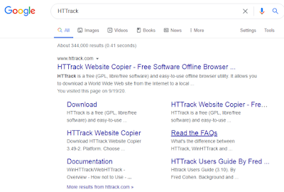
1.Go to your google home page and search the software name as HTTrack


2.Now enter in the website by clicking on www.httrack.com. After clicking you can see the interface as below image. On the above menu there is a download button, click on that and move on.


3.After clicking the download menu you can see the versions of this software, now choose the version according to your PC's requirement. And download it.


INSTALLING THE SOFTWARE

After downloading, now we are going to install the software.

1.After clicking on the software's .exe file, this type of window will popup, don't do anything, just click on the next button.


2.Now accept the agreement by clicking on the radio button and click next.


3.Choose the location, where you want to save the file/source code by using browse button and click next 


4.Check the all options and click on the next button


5.You can see the install button click on it to install the software


6.Now check the Launch WinHTTrack website copier's option and click on finish


GET THE SOURCE CODE

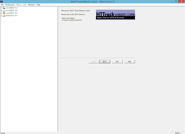
1.Once you launch the HTTrack software, you will see the interface like in below image you just click on next button and move on.


2.Now enter the name of you project, and select the category of which you want to extract the files, in my case I want to extract the html file of the website. Now click on next button.


3.You can see the Add URL button click on it to add your URL. 


4.After clicking on the Add URL button a popup window will appear on your screen, now only add the URL of the website, of which you want to get the source code and click OK.


5.After adding the URL click on the next button.


6.This page is not important just click on Finish and move on.

7.Your process has been started it will take few minutes, don't skip anything. It depends on  the files if you have the large file it will take more time to download and adjusting the source code.


8.When download complete you can see this type of window, do nothing and click on the Finish button.


FIND THE CODE

Go to your Local Disk C and search your folder. Once you find the folder, open it.

You can see the many files and folder, now i'm going to open the 2nd folder.

As you can see i have the all html css javascript files and also i have the all assets of the website now lets open one of this file in our code editor 

CHECK THE CODE

So friends finally, did you see that OMG what is this, we can see all the code of that website, now you can change the code or get the idea from this code or anything that you want you can do from it. 


So friends, stay tuned with my website for more informative and interesting material.


Monday, 6 April 2020

How to make Login form by using neumorphism Css

Login Form with Neumorphism Css:


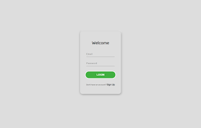
For the perfect and beautiful view is gained by neumorphism. In Css their are many type of options which you can select and make your web layout beautiful. So here we use neumorphism and maked our login form prefectly and creative.

HTML CODE:

!DOCTYPE html>
<html lang="en">
<head>
    <meta charset="UTF-8">
    <meta name="viewport" content="width=device-width, initial-scale=1.0">
    <title>Document</title>
<link rel="stylesheet" href="style.css">
</head>
<body>
<section class="login">
    <div class="container">
<div class="login-sec">
<div class="text">
<h2>Welcome</h2>
</div>
<div class="form">
<input type="text" name="Email" placeholder="Email" id=""><br>
<input type="text" name="password" placeholder="Password" id=""><br>
<button type="submit" class="btn">LOGIN</button>
<br>
<p class="para">
Don't have an account? <a href="#">Sign Up</a>
</p>
</div>
</div>
</div>
</section>
</body>
</html>

We used above HTML code for making the simple diagram of our form. We used some div's like: Container, login-sec, text and form.
In the text div we gave it a heading called welcome then in the form div we used 2 input type and 1 button for submission. Then we took a paragraph by using its class para and at the last we used a anchor tag which make the Sign Up button click able.


Font:

Here is the font that we used for our login-form, its name is Baloo Thambi:

@import url('https://fonts.googleapis.com/css2?family=Baloo+Thambi+2&display=swap');

CSS CODE:

In our Css code we used some padding and margins and we used some background color and neumorphism property, that give the border's up and down shadow which looks really amazing, then we gives the color and border of button.

@import url('https://fonts.googleapis.com/css2?family=Baloo+Thambi+2&display=swap');
body{
padding: 0%;
margin: 0%;
font-family: 'Baloo Thambi 2', cursive
}
.login{
background-color: #dae1eb;
}
.container{
background-color:#dddddd;
height: 100vh;
width: 100%;
align-content: center;
justify-content: center;
display: flex;

}
.login-sec{
background-color:#dddddd;
border-radius: 15px;
width:200px;
height: 340px;
text-align: center;
transform: translateY(50%);
padding: 30px;
box-shadow: 2px 2px 1rem rgba(0, 0,0,.4) ,
  4px -4px 10px rgb(255, 255,255);
}
.text h2{
color: rgba(14, 15, 14, 0.897);
padding-bottom: 15px;
font-size: 28px;
}
.form input{
background-color: transparent;
outline: none;
border: none;
border-bottom: 1px solid gray;
width: 90%;
padding-bottom: 10px;
margin-bottom: 30px;
font-size: 13px;
letter-spacing: 0.1rem;
}
.form .btn{
outline: none;
background-color: rgb(64, 175, 64);
padding: 13px 70px 13px 70px;
font-size: 16px;
color: white;
font-weight: 550;
border-radius: 30px;
border: 3px solid rgba(255, 255, 255);
}
.form .btn:hover{
cursor: pointer;
background-color: rgb(64, 175, 9);
}
.form .para{
font-size: 13px;
margin-top: 25px;
}
.form .para a{
font-size: 16px;
text-decoration: none;
font-weight: bold;
color: black;
}

Saturday, 4 April 2020

404 custom page with animation

How to make animated 404 page:


                                       HTML CODE:

<html lang="en" >
<head>
  <meta charset="UTF-8">
  <title>Parallax Error 404 | Webdevtrick.com</title>
  <link rel="stylesheet" href="style.css">
 
</head>
<body>
 
    <section class="wrapper">
        <div class="container">
            <div id="PRllax" class="PRllax" data-hover-only="false">
 
                <div class="circle" data-depth="1.2"></div>
 
                <div class="one" data-depth="0.9">
                    <div class="content">
                        <span class="piece"></span>
                        <span class="piece"></span>
                        <span class="piece"></span>
                    </div>
                </div>
 
                <div class="two" data-depth="0.60">
                    <div class="content">
                        <span class="piece"></span>
                        <span class="piece"></span>
                        <span class="piece"></span>
                    </div>
                </div>
 
                <div class="three" data-depth="0.40">
                    <div class="content">
                        <span class="piece"></span>
                        <span class="piece"></span>
                        <span class="piece"></span>
                    </div>
                </div>
 
                <p class="p404" data-depth="0.50">404</p>
                <p class="p404" data-depth="0.10">404</p>
 
            </div>
 
            <div class="text">
                <article>
                    <p>This page has not been found. <br>You have lost!</p>
                    <button>go to home</button>
                </article>
            </div>
 
        </div>
    </section>
 
<script src='https://cdnjs.cloudflare.com/ajax/libs/parallax/3.1.0/parallax.min.js'></script>
<script src='https://cdnjs.cloudflare.com/ajax/libs/jquery/2.1.3/jquery.min.js'></script>
<script src="function.js">
    </script>
 
</body>
</html>

JAVASCRIPT CODE:
var PRllax = document.getElementById('PRllax');
 var parallax = new Parallax(PRllax);

CSS CODE:

@import url("https://fonts.googleapis.com/css?family=Josefin+Sans&display=swap");
 
h1,h2,h3,h4,h5,h6,p,ul,li,button,a,i,input,body {
  margin: 0;
  padding: 0;
  list-style: none;
  border: 0;
  -webkit-tap-highlight-color: transparent;
  text-decoration: none;
  color: inherit;
}
 
body {
  margin: 0;
  padding: 0;
  height: auto;
  font-family: 'Josefin Sans', sans-serif;
  background: #ff5757;
}
 
.wrapper {
  display: grid;
  grid-template-columns: 1fr;
  justify-content: center;
  align-items: center;
  height: 100vh;
  overflow-x: hidden;
}
.wrapper .container {
  margin: 0 auto;
  transition: all 0.4s ease;
  display: flex;
  justify-content: center;
  align-items: center;
  position: relative;
}
.wrapper .container .PRllax {
  position: absolute;
  width: 100vw;
  height: 100vh;
  vertical-align: middle;
}
.wrapper .container .one,
.wrapper .container .two,
.wrapper .container .three,
.wrapper .container .circle,
.wrapper .container .p404 {
  width: 60%;
  height: 60%;
  top: 20% !important;
  left: 20% !important;
  min-width: 400px;
  min-height: 400px;
}
.wrapper .container .one .content,
.wrapper .container .two .content,
.wrapper .container .three .content,
.wrapper .container .circle .content,
.wrapper .container .p404 .content {
  width: 600px;
  height: 600px;
  display: flex;
  justify-content: center;
  align-items: center;
  position: absolute;
  top: 50%;
  left: 50%;
  transform: translate(-50%, -50%);
  animation: content 0.8s cubic-bezier(1, 0.06, 0.25, 1) backwards;
}
@keyframes content {
  0% {
    width: 0;
  }
}
.wrapper .container .one .content .piece,
.wrapper .container .two .content .piece,
.wrapper .container .three .content .piece,
.wrapper .container .circle .content .piece,
.wrapper .container .p404 .content .piece {
  width: 200px;
  height: 80px;
  display: flex;
  position: absolute;
  border-radius: 80px;
  z-index: 1;
  animation: leftdir 8s cubic-bezier(1, 0.06, 0.25, 1) infinite both;
}
@keyframes leftdir {
  50% {
    left: 80%;
    width: 10%;
  }
}
@keyframes rightdir {
  50% {
    right: 80%;
    width: 10%;
  }
}
@media screen and (max-width: 799px) {
  .wrapper .container .one,
  .wrapper .container .two,
  .wrapper .container .three,
  .wrapper .container .circle,
  .wrapper .container .p404 {
    width: 90%;
    height: 90%;
    top: 5% !important;
    left: 5% !important;
    min-width: 280px;
    min-height: 280px;
  }
}
@media screen and (max-height: 660px) {
  .wrapper .container .one,
  .wrapper .container .two,
  .wrapper .container .three,
  .wrapper .container .circle,
  .wrapper .container .p404 {
    min-width: 280px;
    min-height: 280px;
    width: 60%;
    height: 60%;
    top: 20% !important;
    left: 20% !important;
  }
}
.wrapper .container .text {
  width: 60%;
  height: 40%;
  min-width: 400px;
  min-height: 500px;
  position: absolute;
  margin: 40px 0;
  animation: text 0.6s 1.8s ease backwards;
}
@keyframes text {
  0% {
    opacity: 0;
    transform: translateY(40px);
  }
}
@media screen and (max-width: 799px) {
  .wrapper .container .text {
    min-height: 400px;
    height: 80%;
  }
}
.wrapper .container .text article {
  width: 400px;
  position: absolute;
  bottom: 0;
  z-index: 4;
  display: flex;
  flex-direction: column;
  justify-content: center;
  align-items: center;
  text-align: center;
  bottom: 0;
  left: 50%;
  transform: translateX(-50%);
}
@media screen and (max-width: 799px) {
  .wrapper .container .text article {
    width: 100%;
  }
}
.wrapper .container .text article p {
  color: white;
  font-size: 18px;
  letter-spacing: 0.6px;
  margin-bottom: 40px;
  text-shadow: 6px 6px 10px #32243E;
}
.wrapper .container .text article button {
  height: 40px;
  padding: 0 30px;
  border-radius: 50px;
  cursor: pointer;
  box-shadow: 0px 15px 20px rgba(54, 24, 79, 0.5);
  z-index: 3;
  color: #695681;
  background-color: white;
  text-transform: uppercase;
  font-weight: 600;
  font-size: 12px;
  transition: all 0.3s ease;
}
.wrapper .container .text article button:hover {
  box-shadow: 0px 10px 10px -10px rgba(54, 24, 79, 0.5);
  transform: translateY(5px);
  background: #212121;
  color: white;
}
.wrapper .container .p404 {
  font-size: 200px;
  font-weight: 700;
  letter-spacing: 4px;
  color: white;
  display: flex !important;
  justify-content: center;
  align-items: center;
  position: absolute;
  z-index: 2;
  animation: anime404 0.6s cubic-bezier(0.3, 0.8, 1, 1.05) both;
  animation-delay: 1.2s;
}
@media screen and (max-width: 799px) {
  .wrapper .container .p404 {
    font-size: 100px;
  }
}
@keyframes anime404 {
  0% {
    opacity: 0;
    transform: scale(10) skew(20deg, 20deg);
  }
}
.wrapper .container .p404:nth-of-type(2) {
  color: #36184F;
  z-index: 1;
  animation-delay: 1s;
  filter: blur(10px);
  opacity: 0.8;
}
.wrapper .container .circle {
  position: absolute;
}
.wrapper .container .circle:before {
  content: '';
  position: absolute;
  width: 800px;
  height: 800px;
  background-color: rgba(54, 24, 79, 0.2);
  border-radius: 100%;
  top: 50%;
  left: 50%;
  transform: translate(-50%, -50%);
  box-shadow: inset 5px 20px 40px rgba(54, 24, 79, 0.25), inset 5px 0px 5px rgba(50, 36, 62, 0.3), inset 5px 5px 20px rgba(50, 36, 62, 0.25), 2px 2px 5px rgba(255, 255, 255, 0.2);
  animation: circle 0.8s cubic-bezier(1, 0.06, 0.25, 1) backwards;
}
@keyframes circle {
  0% {
    width: 0;
    height: 0;
  }
}
@media screen and (max-width: 799px) {
  .wrapper .container .circle:before {
    width: 400px;
    height: 400px;
  }
}
.wrapper .container .one .content:before {
  content: '';
  position: absolute;
  width: 600px;
  height: 600px;
  background-color: rgba(54, 24, 79, 0.3);
  border-radius: 100%;
  box-shadow: inset 5px 20px 40px rgba(54, 24, 79, 0.25), inset 5px 0px 5px rgba(50, 36, 62, 0.3), inset 5px 5px 20px rgba(50, 36, 62, 0.25), 2px 2px 5px rgba(255, 255, 255, 0.2);
  animation: circle 0.8s 0.4s cubic-bezier(1, 0.06, 0.25, 1) backwards;
}
@media screen and (max-width: 799px) {
  .wrapper .container .one .content:before {
    width: 300px;
    height: 300px;
  }
}
.wrapper .container .one .content .piece {
  background: linear-gradient(90deg, #8077EA 13.7%, #EB73FF 94.65%);
}
.wrapper .container .one .content .piece:nth-child(1) {
  right: 15%;
  top: 18%;
  height: 30px;
  width: 120px;
  animation-delay: 0.5s;
  animation-name: rightdir;
}
.wrapper .container .one .content .piece:nth-child(2) {
  left: 15%;
  top: 45%;
  width: 150px;
  height: 50px;
  animation-delay: 1s;
  animation-name: leftdir;
}
.wrapper .container .one .content .piece:nth-child(3) {
  left: 10%;
  top: 75%;
  height: 20px;
  width: 70px;
  animation-delay: 1.5s;
  animation-name: leftdir;
}
.wrapper .container .two .content .piece {
  background: linear-gradient(90deg, #f79d00 0%, #64f38c 100%);
}
.wrapper .container .two .content .piece:nth-child(1) {
  left: 0%;
  top: 25%;
  height: 40px;
  width: 120px;
  animation-delay: 2s;
  animation-name: leftdir;
}
.wrapper .container .two .content .piece:nth-child(2) {
  right: 15%;
  top: 35%;
  width: 180px;
  height: 50px;
  animation-delay: 2.5s;
  animation-name: rightdir;
}
.wrapper .container .two .content .piece:nth-child(3) {
  right: 10%;
  top: 80%;
  height: 20px;
  width: 160px;
  animation-delay: 3s;
  animation-name: rightdir;
}
.wrapper .container .three .content .piece {
  background: linear-gradient(90deg, #3498db 0%, #2c3e50 100%);
}
.wrapper .container .three .content .piece:nth-child(1) {
  left: 25%;
  top: 35%;
  height: 20px;
  width: 80px;
  animation-name: leftdir;
  animation-delay: 3.5s;
}
.wrapper .container .three .content .piece:nth-child(2) {
  right: 10%;
  top: 55%;
  width: 140px;
  height: 40px;
  animation-name: rightdir;
  animation-delay: 4s;
}
.wrapper .container .three .content .piece:nth-child(3) {
  left: 40%;
  top: 68%;
  height: 20px;
  width: 80px;
  animation-name: leftdir;
  animation-delay: 4.5s;
}

Sunday, 29 March 2020

UI DESIGN BUTTONS ON/OFF HTML5 AND CSS3


CSS3 CODING:


<style>
@import url('https://fonts.googleapis.com/css? family=Poppins:200,300,400,500,600,700,800,900&display+swap');

*{
    margin: 0;
    padding: 0;
    box-sizing: border-box;
    font-family: 'Poppins',sans-serif;
}
body{
    display: flex;
    justify-content: center;
    align-items: center;
    flex-direction: column;
    height: 100vh;
    overflow: hidden;
    background: #191919;
}
label{
    position: relative;
    width: 240px;
    height: 80px;
    cursor: pointer;
    margin: 20px 0;
}
label input{
    opacity: 0;
}
.check{
    position: absolute;
    top: 0;
    left: 0;
    cursor: pointer;
    width: 100%;
    height: 100%;
    background:#101010;
    border-radius: 40px;
    box-shadow: 0 0 0 4px #101010;
}
.check:before{
    content: '';
    position: absolute;
    top: calc(50% - 4px);
    left: -30px;
    width: 8px;
    height: 8px;
    border-radius: 50%;
    background:#f00;
    transition: 0.5s;
    box-shadow: 0 0 5px #f00, 0 0 10px #f00, 0 0 20px #f00, 0 0 40px #f00,0 0 80px #f00;
}
label input:checked~ .check:before{
    background:#101010;
    box-shadow: none;
}
.check:after{
    content: '';
    position: absolute;
    top: calc(50% - 4px);
    right: -30px;
    width: 8px;
    height: 8px;
    border-radius: 50%;
    background:#101010;
    transition: 0.5s;
    box-shadow:none;
}
label input:checked~ .check:after{
    background: #0f0;
    box-shadow: 0 0 5px #0f0 , 0 0 10px #0f0 , 0 0 20px #0f0 , 0 0 40px #0f0 , 0 0 80px #0f0;
}
.btn{
    position: absolute;
    top:0;
    left: 0;
    width:120px;
    height:80px;
    border-radius: 40px;
    background: #333333;
    box-shadow: inset 0 -20px 15px #292929, inset 0 20px 15px #292929;
    transition: 0.5s;
}
.btn:before{
    content: '';
    position: absolute;
    top: 0;
    left: 0;
    width:52px;
    height: 80px;
    /* background: #252525; */
    background: linear-gradient(0deg, #191919,#2f2f2f);
    border-top-left-radius: 80px;
    border-bottom-left-radius: 80px;
    filter:blur(2px);
    box-shadow: inset -5px -5px 15px rgba(0,0,0,0.3);
}
.btn:after{
    content: '';
    position: absolute;
    top: 0;
    right: 0;
    width:52px;
    height: 80px;
    /* background: #252525; */
    background: linear-gradient(0deg, #191919,#2f2f2f);
    border-top-right-radius: 80px;
    border-bottom-right-radius: 80px;
    filter:blur(2px);
    box-shadow: inset 5px -5px 15px rgba(0,0,0,0.3);
}
label input:checked~ .btn{
    left: 50%;
}

</style>

HTML5 CODING:

<html lang="en">
<head>
    
    <title>Checkbox UI Design</title>
    <link href="style.css" rel="stylesheet"></link>
</head>
<body>
    <label>
        <input name="" type="checkbox" />
        <span class="check"></span>
        <span class="btn"></span>
    </label>
    <label>
        <input name="" type="checkbox" />
        <span class="check"></span>
        <span class="btn"></span>
    </label>
</body>
</html>